ATLFreight.com
Role: UX, UI, Visual, Development, Support
Sitemap


One of the east coast’s premier freight companies with a talented and hard-working staff
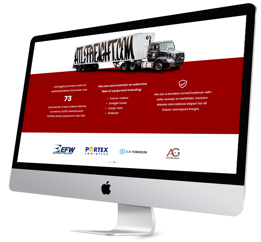
Homepage
Callouts & Page Breaks
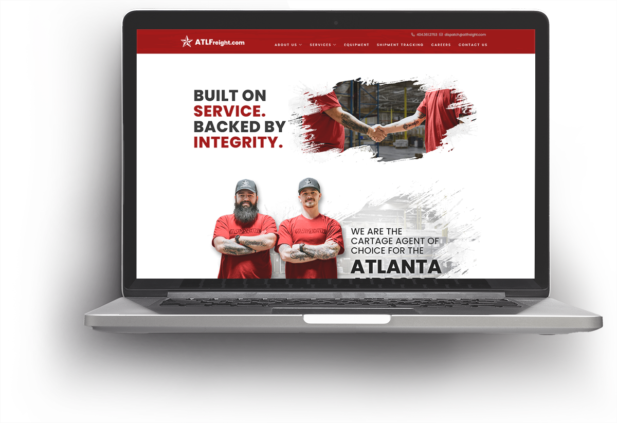
Part of the website needed more direct attention, mostly pertaining to important numbers or other services that made them stand apart from the competition. For these areas, I programed a parallax red background.
I made a grunge look into a slightly opaque PNG and set that over the red background., When scrolling the PNG would shift slightly on the vertical axis which gave the site a subtle animation effect.
I also programmed an animating carousel for the client logos as well as the testimonials. These simple animations give the homepage a customized look and bring this site up to date.

Summary
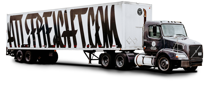
Working with the wonderful ATLFreight team and the fantastic Nancy Trowbridge, who did a lot of work as the producer, we met all of the goals and everyone was happy with the end result. The website got many compliments from team members as well as their clientele. The photographer, Kandace Ventura really pulled the site together with absolutely stunning imagery.
We plan to update the site with any new partners, testimonials, and images as time progresses. The backend of the website was simplified and it will now be easier to add these changes in the future.