Tata TCS Interactive Wall
Role: UX, UI, Visual
Problem:
Use Tata's company info from a 44 page document provided to educate customers at a large event
Hypothesis:
Indian multinational conglomerate holding company with $100+ billion revenue
Menu
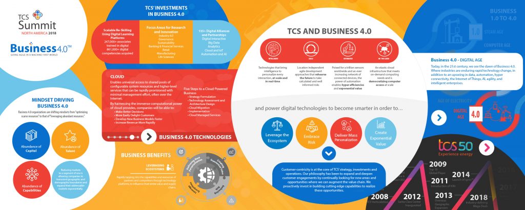
When I first received Tata’s 44 page text document of the content they wanted on the touchscreen I was a little overwhelmed. I read through it all and digested the message that they wanted to convey. I broke the document into sections and chapters.
My first designs used a menu on the left side with a website design in mind. Upon reviewing this on a test screen setup I realized it would only allow one person at a time to interact with the presentation.
This was very limiting and would waste valuable real estate offered by a huge touch surface.
Another thing that came to mind were the users, as a designer I always want to create things with their perspective in mind. This was going to be around an audience that would likely be more inclined to feel intimidated using tech of this magnitude.
I figured that I wouldn’t want to be “in control” of a massive tech wall while a hundred people walking by were watching me. I put it along the lines of getting an iPad for the first time and having a group of fifty people watch me as I tinker with it and learn how to use it.
I needed this to be two things: Easily approachable and pleasantly engaging

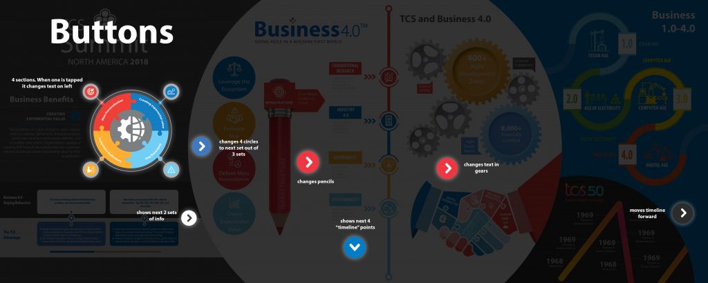
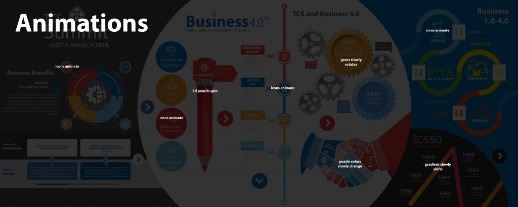
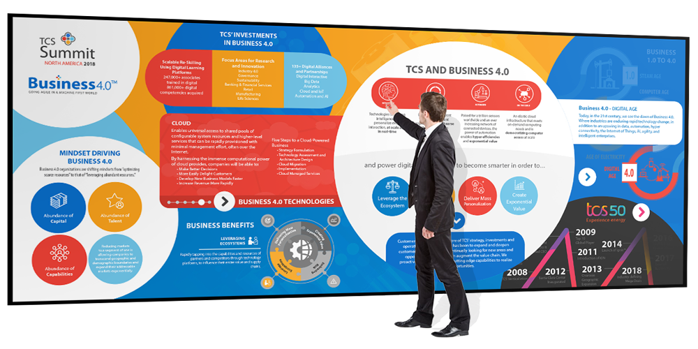
I went through multiple variations on how to best accomplish this and ended up formulating big approachable buttons that pulsed to show they were touchable. These would trigger individual interfaces with their content. I used bright, big, bold colors to make it friendly and playful.
The final product was colorful and I designed the UX to only go 4 layers deep at max in order to not confuse the user. I made the UI large and approachable and simplified the buttons and touch-points. The buttons were animated to show that they were interactive.
Summary
The setup was a hit and customers came up constantly to play with it.
People loved that each button did a different thing and the animations on the interactions made it fun to use. A lot of questions were asked to the on-site Tata team about how they could receive more information pertaining to certain categories displayed.
Contacts were made, leads were generated and revenue rose. Mission accomplished.