Bank of America Interactive
Role: UX, UI, Visual, Programming
Problem:
Bank of America has a lot of content that isn't particularly accessible or digestible to the average person, business or investor.
Hypothesis:
User Journey:
- Business needs to access a PDF, video or whitepaper
- The client reaches out to Bank of America
- Bank of America responds with proper app containing their sector
- The app is downloaded or visited on a browser
- Content is explored and downloaded

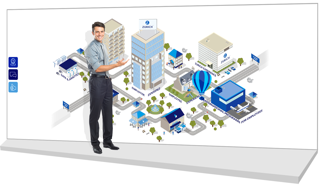
Global insights and smart solutions that make it easier to do business
Email & Download
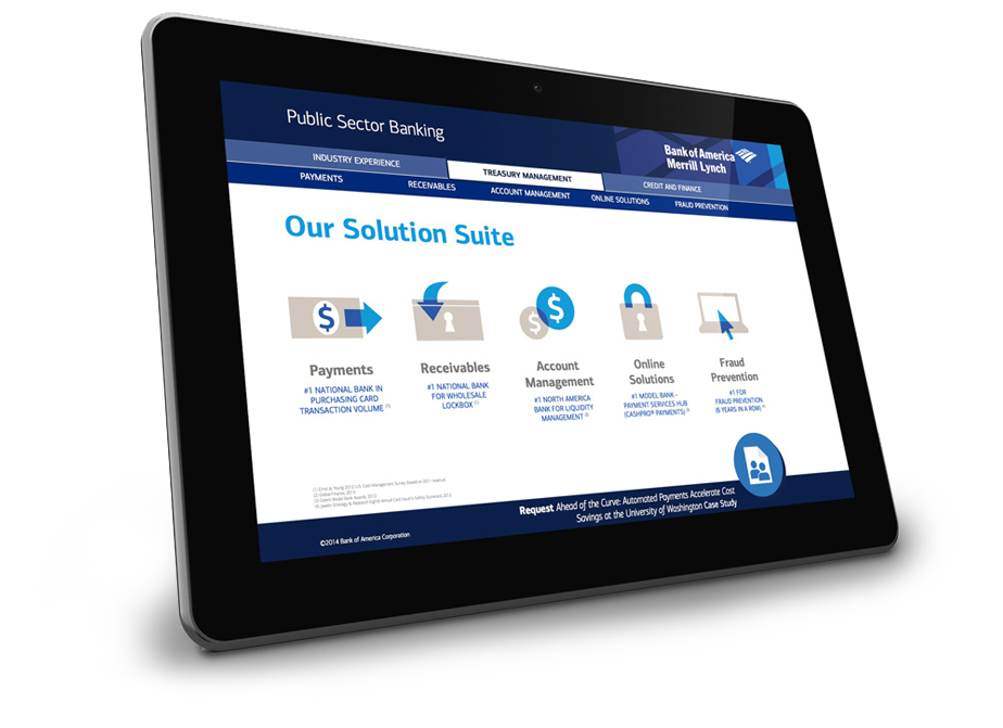
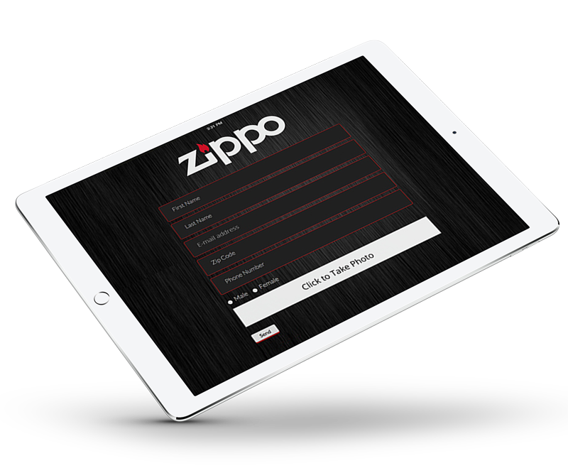
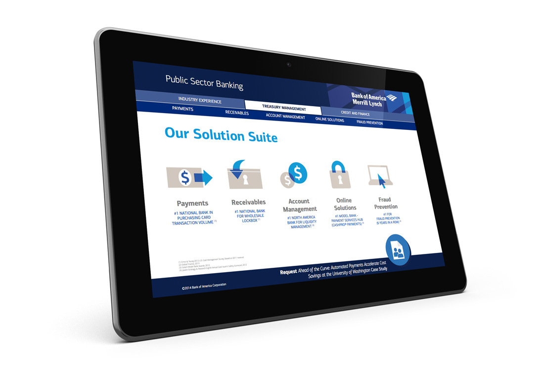
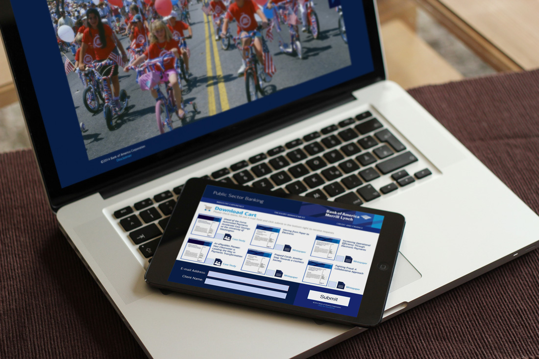
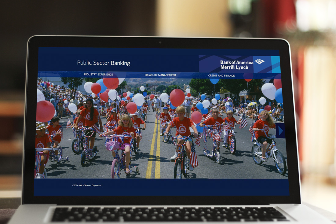
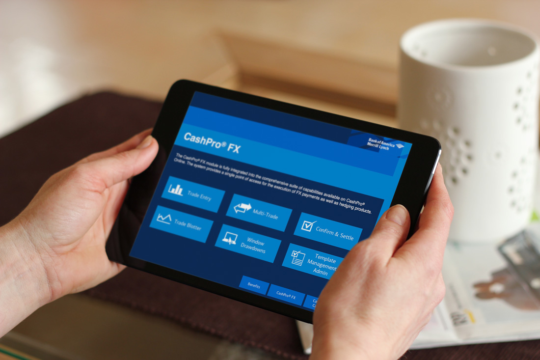
Public Sector Banking
These Bank of America employees were on PCs and were traveling to meet their prospective clients for an in person one-on-0ne.
They needed a takeaway that could be emailed to their client. It had to have a small file size, viewable on desktop only, and needed to be contained into a single transportable file.
I created this as an interactive PDF with Adobe InDesign
Analytics & Cache
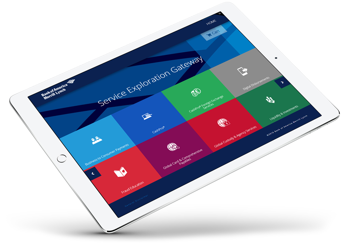
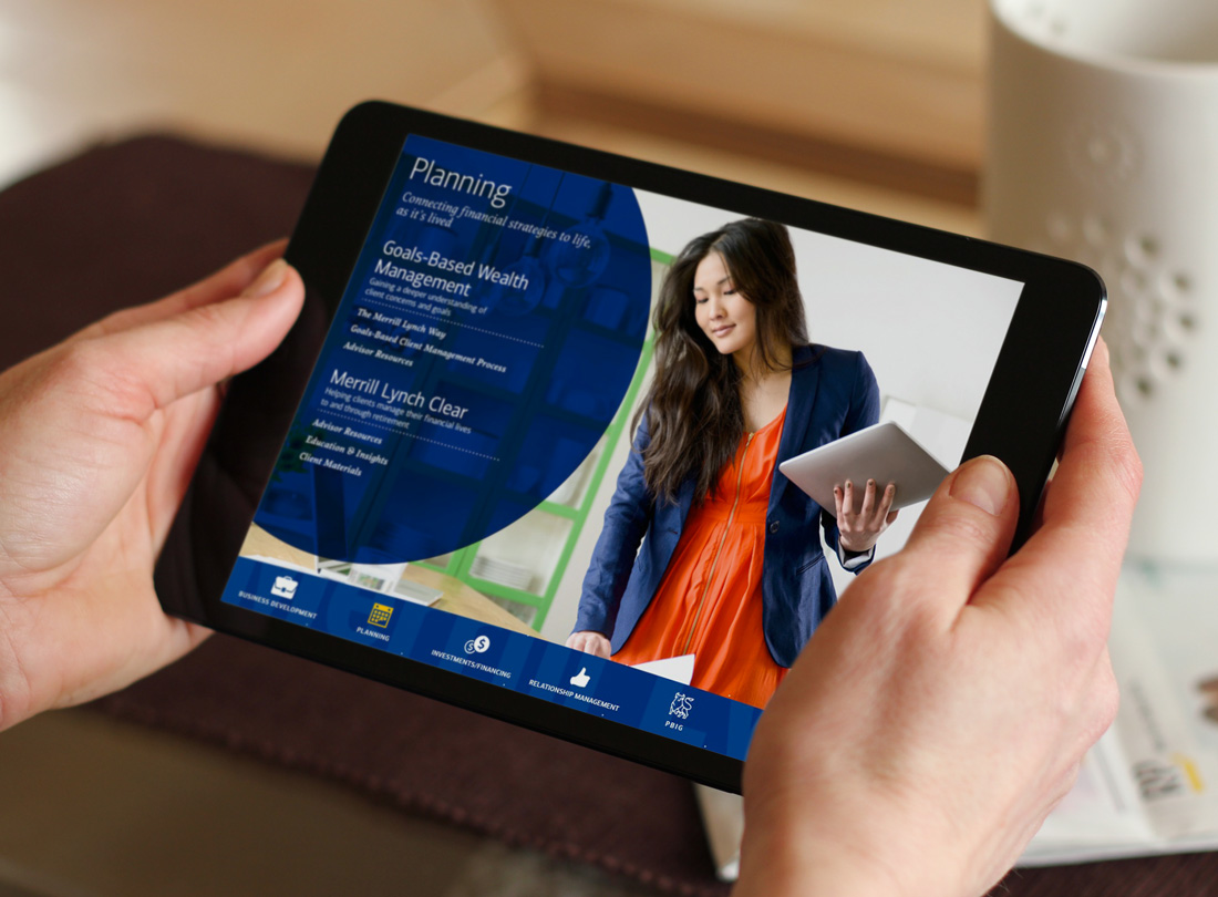
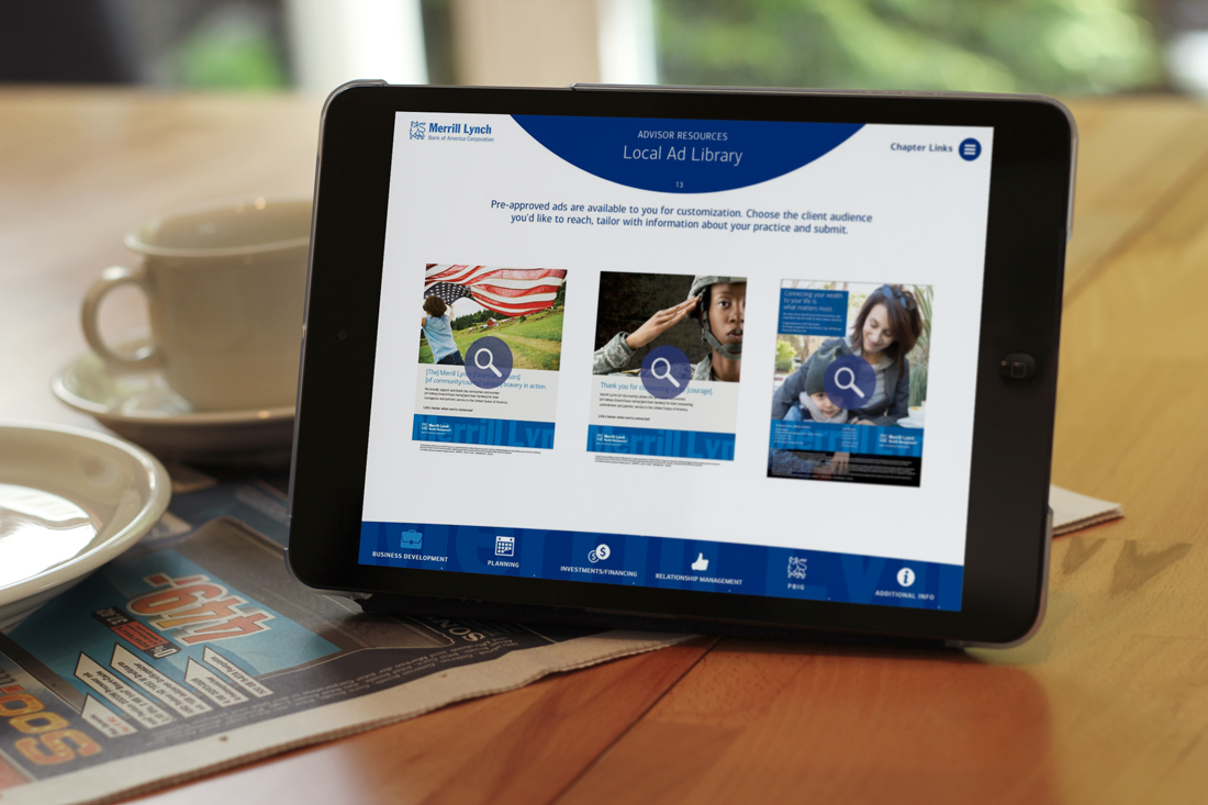
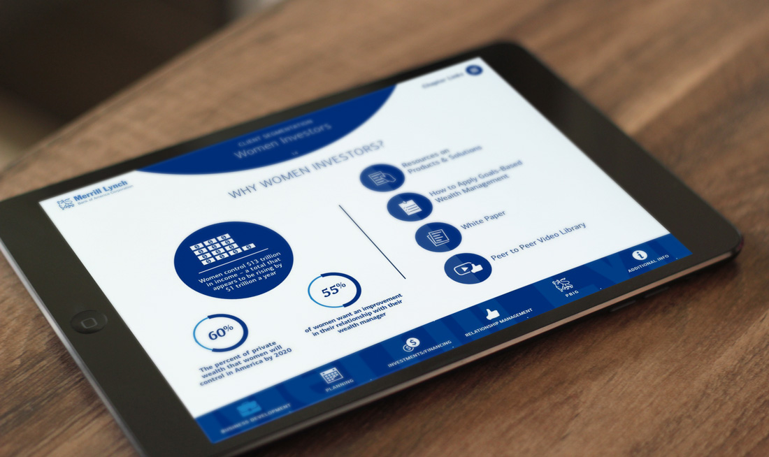
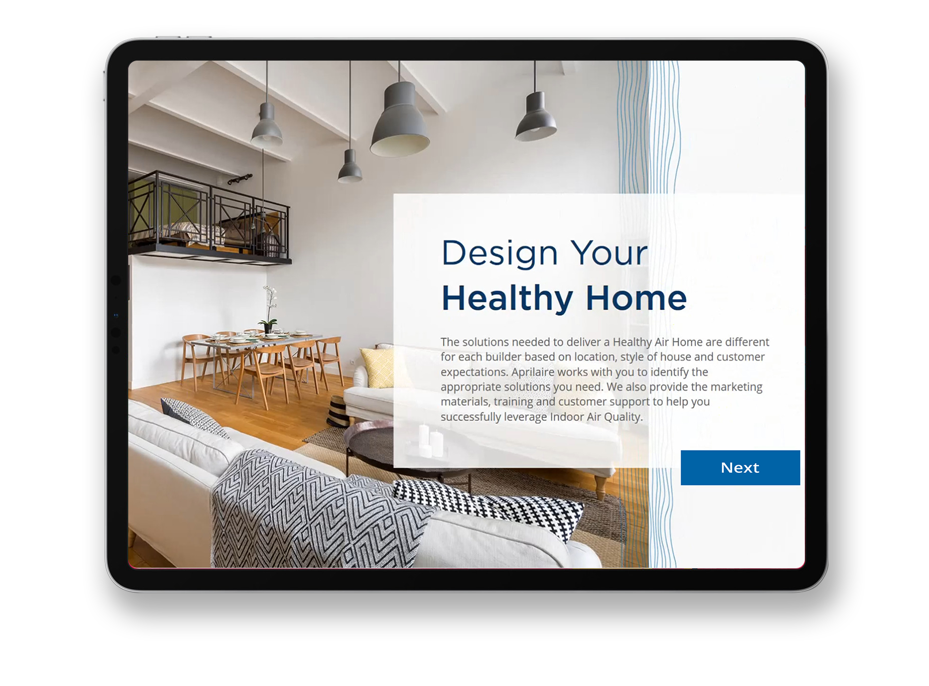
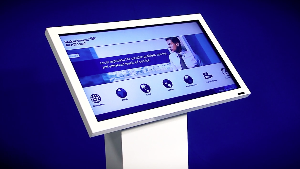
Service Exploration Gateway
This app needed to be viewable on an iPad and desktop. They were unable to download apps on the company iPad so that was out of the question as well.
We decided to do a web app. I put a cache in the header so that it could be stored offline.
The CMS of the app had to be easy to navigate for the client to be able to upload new items as well. It was set up as a simple drag and drop for a PDF as well as a video. The website itself was built with a touchscreen in mind, using large buttons and simple navigation.
The main page was a huge menu so the user could dive right into what they wanted.
After adding a PDF to their cart and "checking out" the user would be emailed their documents. This allowed Bank of America to have great analytics on the data collection and they were able to reach out to any interested client while knowing exactly what they were interested in.
Retirement and Benefit Plan Service App
This app was very similar to the Gateway and the solution to that ended up working great. The Bank of America team needed this app to be left with the client they were pitching to. This was accomplished by sending an invite to the website in an email directed to the future customer.
They were able to get granular analytics on each of their clients with a tracking link on the email to see if they needed to reach back out to them.
Big & Editable